# Your WattTrim Portal Dashboard: Every Card Explained
Your WattTrim Sentinel Portal puts your electricity data, plan details, and savings picture in one place. The dashboard is accessible at gridwiseaudit.com/portal, where you can check what you are paying, see how your home uses energy, and spot opportunities before your next renewal.
Cards are reorderable. Use drag and drop to customize the layout so the information you check most often appears first. The dashboard becomes more useful as it collects Smart Meter Texas data and as you add actual bills and plan history.
> All screenshots show sample data with personal information masked.
How to Read the Dashboard
The dashboard combines several kinds of information because no single number tells the whole story of an electricity plan. Smart Meter Texas supplies interval usage and production data, your profile supplies contract details, and uploaded bills supply the charges and credits that appear on statements. Together, these sources show both what happened and why it happened.
Some cards update on different schedules. Meter readings depend on the weekly data pull, while the Solar Sell Price card follows a live market feed and can change every five minutes. Estimated figures are useful for a timely view, but uploading a bill replaces an estimate with the amount your provider actually charged. If a number looks unexpected, check the last pull date, your profile settings, and the relevant bill before drawing a conclusion.
The dashboard also separates imported energy from exported solar energy. Imported kWh represent electricity supplied by the grid, while exported kWh represent energy sent back to the grid for a credit under your plan terms. Keeping those flows distinct makes it easier to understand a solar plan, compare export compensation with wholesale prices, and see whether a rate change affected the energy you buy, the energy you sell, or both.
Start Here: Your Account and Live Monitoring
Welcome Card

The Welcome Card is your home base. It shows the subscriber email, TDU service area, ZIP code, and a Solar badge when solar information is on your profile, along with buttons to View Plans and Run New Audit. This quick summary confirms that the portal is using the right account and service location before you review rates or savings.
Smart Meter Monitoring
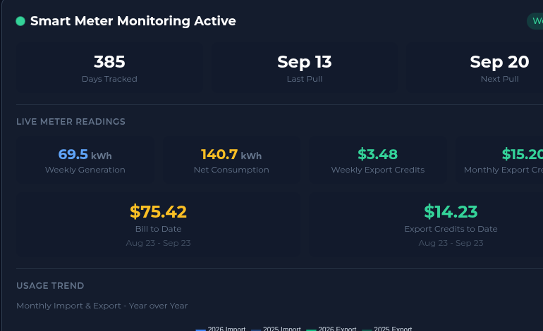
Smart Meter Monitoring shows how many days have been tracked, the dates of the last and next data pulls, and live meter readings. Those readings include weekly generation, net consumption, weekly export credits, average monthly export credits, bill to date, and export credits to date. Automatic weekly pulls from Smart Meter Texas replace guesswork with your actual usage, helping recommendations and savings calculations reflect how your home really operates.
Rates, Solar, and Usage Patterns
Rate Trends
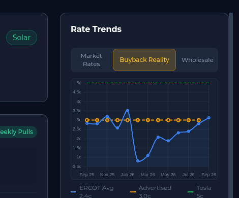
Rate Trends is a sidebar card with three tabs: Market Rates, Buyback Reality, and Wholesale. Market Rates helps you compare current offers with your locked-in rate, while Buyback Reality compares advertised solar buyback rates with actual ERCOT wholesale prices. The Wholesale tab adds market context, so you can tell whether a plan looks competitive because of a real advantage or simply because of marketing language.
Solar Sell Price
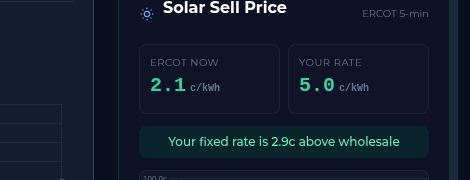
Solar Sell Price is a sidebar card for solar customers. It compares the real-time ERCOT wholesale price with your contracted export rate, updating every five minutes. Seeing how far your fixed rate sits above or below wholesale right now helps you understand the value of your export terms instead of judging them from the headline rate alone.
Usage Trend
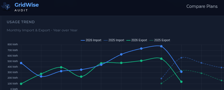
Usage Trend charts monthly imports and exports year over year, comparing 2025 with 2026. Seasonal patterns become easier to see, and you can tell whether consumption is growing, shrinking, or staying consistent compared with the same months last year. That context helps separate a plan problem from a change in weather, household routine, or solar production.
Export Credit Comparison
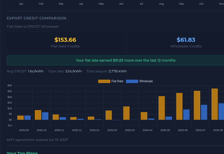
Export Credit Comparison is for solar customers. It compares flat-rate export credits with what you would have earned at ERCOT wholesale prices during the last 12 months, using a month-by-month bar chart and a rolling total. It answers a practical question: is your fixed buyback rate actually a good deal for the energy you send to the grid?
Plan Recommendations and Contract Timing
Your Top Plans
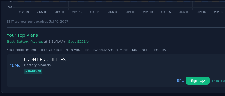
Your Top Plans recommends plans using your actual weekly Smart Meter data, not generic estimates. Each recommendation can show the provider, plan name, term, rate, annual savings, a PARTNER badge when applicable, an Electricity Facts Label link, a Sign Up button, and a phone number. Because the comparison uses your usage pattern, you can evaluate likely annual cost and savings with more confidence before switching.
WattTrim's plan rankings are based solely on your actual usage data. Provider compensation never influences your results.
Provider Status
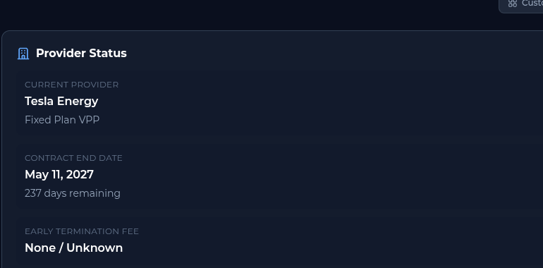
Provider Status shows your current provider, plan type, contract end date, days remaining, and early termination fee. Keeping this information visible means you can prepare for renewal instead of drifting into a potentially expensive month-to-month or automatic renewal rate. Check it before shopping, particularly when the countdown gets close to zero.
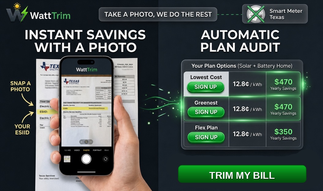
The Cost of Your Electricity
Effective Rate Tracker
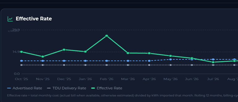
The Effective Rate Tracker is a new card that follows three lines over 12 months: your advertised energy-only rate, the TDU delivery rate, and your effective rate. The effective rate is total cost divided by imported kWh, after fees, credits, and exports are included, so it reflects what you actually paid per imported kilowatt-hour. When you change plans, step changes in the advertised-rate line make the timing and effect of that switch easy to see.
Monthly Cost Comparison
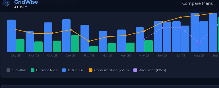
Monthly Cost Comparison uses bars to show old-plan cost versus current-plan cost for each month, with consumption in kWh and a prior-year overlay. Actual bills appear in teal, distinguishing them from estimates. This is the visual proof of whether switching plans saved real money or increased costs after usage and seasonal conditions are taken into account.
Energy Balance
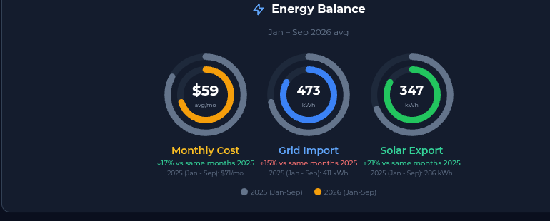
Energy Balance provides three donut charts for average monthly cost, grid import in kWh, and solar export in kWh. Each includes a year-over-year percentage change for a quick health check of your energy profile. A glance can reveal whether a cost change came with more consumption, less solar export, or a meaningful improvement in your overall balance.
Before vs Now
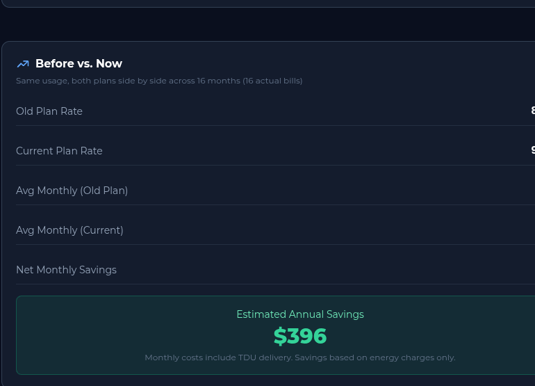
Before vs Now gives a side-by-side comparison of your old plan rate and current plan rate, average monthly cost for each, net monthly savings, and estimated annual savings. It is the bottom-line answer to whether switching was worth it. Use it alongside your actual bills and the Effective Rate Tracker to understand both the headline change and the total cost after fees and credits.
Find Savings in Your Daily Habits
Time of Use Breakdown

Time of Use Breakdown displays a horizontal stacked bar for Day, Night, and Weekend usage, with kWh totals for each period. It shows when you actually consume electricity, rather than assuming a typical household schedule. That information can help identify whether a time-of-use plan might save money, or whether its discounted periods do not match your routine.
Recent Daily Usage
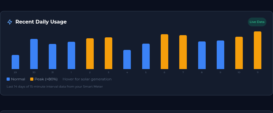
Recent Daily Usage shows bars for the last 14 days and marks peak indicators. It uses 15-minute interval data from Smart Meter Texas, while peak days are highlighted in orange when usage is above 80 percent of normal. Reviewing the pattern can connect a high bill with a specific day, heat event, appliance, or change in household activity.
Keep Your Profile and History Accurate
Edit Profile

Edit Profile is an expandable section for updating your rate, export rate, VPP credit, billing cycle day, and other profile settings. Accurate inputs keep the dashboard's comparisons, estimates, and solar calculations aligned with your contract. Update the profile whenever a provider changes a term or you move to a new plan.
Monthly Bills
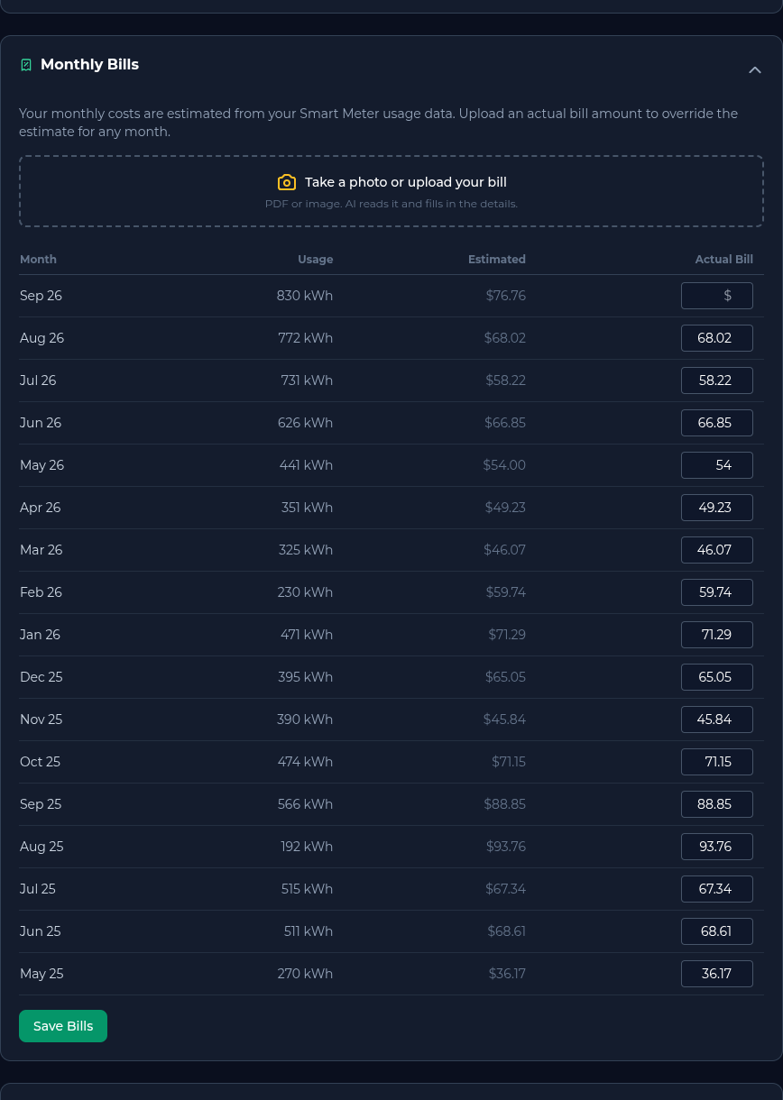
Monthly Bills is an expandable table of your billing data. Uploading actual bills overrides estimates and improves the accuracy of dashboard calculations, including costs, credits, and plan comparisons. Actual statements are especially useful when a bill includes a fee, credit, or adjustment that meter data alone cannot identify.
Plan History
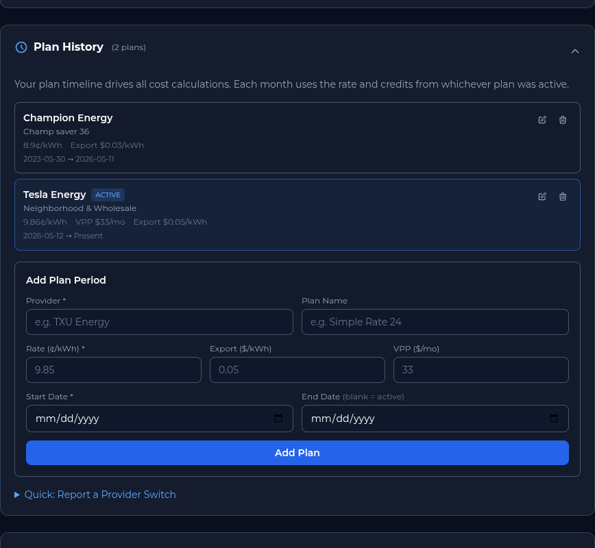
Plan History is an expandable timeline of your electricity plans, including start dates and rates. It gives the dashboard a reliable record of which rate applied during each period and feeds the Effective Rate Tracker with historical plan data. Keeping every switch in the timeline makes long-term savings comparisons more meaningful.
What Sentinel Includes
Your Sentinel Benefits
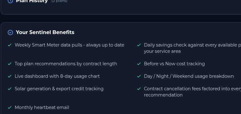
Your Sentinel Benefits is a checklist of what is included with the $4.99 per month Sentinel subscription. It covers weekly data pulls, daily savings checks, top plan recommendations, Before vs Now tracking, the Time of Use Breakdown, solar and export tracking, cancellation-fee math, and a monthly heartbeat email. This card makes it easy to confirm that the monitoring and decision support you expect are part of your active service.
Earn Free Monitoring
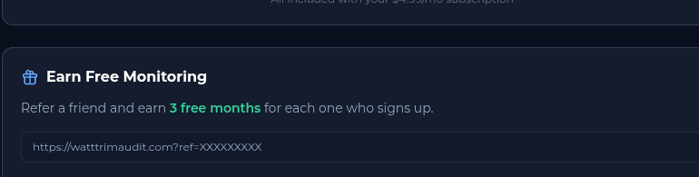
Earn Free Monitoring explains the referral program. Share your personal link, and you earn three free months of Sentinel for each friend who signs up. It is a simple way to extend your monitoring at no cost while helping someone else make a more informed electricity-plan choice.
A Simple Monthly Review
A short review once a month is enough to keep the dashboard useful. First, confirm that Smart Meter Monitoring has a recent pull and that the provider, contract end date, and plan rate in your profile are current. Next, compare the latest actual bill with Monthly Cost Comparison and look at Effective Rate Tracker for changes that may not be obvious from the advertised rate.
If your usage or cost moved, check Recent Daily Usage and Time of Use Breakdown for a pattern. Solar customers can also compare export credits with the wholesale reference and review the current Solar Sell Price. Finally, if renewal is approaching, open Your Top Plans and read each plan's Electricity Facts Label before taking action. This routine turns a large set of cards into a few practical checks: is the data current, is the bill behaving as expected, and is a better plan available?
Make the Dashboard Work for You
Start with the Welcome Card and Smart Meter Monitoring to confirm your account and data connection. Then review Provider Status, Rate Trends, and Your Top Plans before a contract ends, and use Monthly Bills and Plan History to keep the record dependable. Solar customers should pay close attention to Solar Sell Price and Export Credit Comparison, while every customer can use Effective Rate Tracker, Time of Use Breakdown, and Recent Daily Usage to turn a monthly bill into an understandable pattern.
The portal is designed to support decisions, not replace your judgment. Plan terms can include fees, minimum usage rules, credits, and eligibility conditions, so read the Electricity Facts Label before enrolling. When you are ready to establish your baseline, Run Your Free Audit. Run your first audit for free to get started. The audit is used as a data starting point for the Dashboard and Profile View.
Put This Knowledge to Work
Compare your current plan against 1,500+ options across all 6 Texas TDU service areas, including exclusive broker-negotiated rates not found on PowerToChoose.org. Always free.
Trim My Bill